🎓 Top 15 Udemy Courses (80-90% Discount): My Udemy Courses - Ramesh Fadatare — All my Udemy courses are real-time and project oriented courses.
▶️ Subscribe to My YouTube Channel (178K+ subscribers): Java Guides on YouTube
▶️ For AI, ChatGPT, Web, Tech, and Generative AI, subscribe to another channel: Ramesh Fadatare on YouTube
Introduction
A neon text effect in CSS adds a glowing, vibrant look to your text, mimicking the appearance of neon lights. This is achieved using the text-shadow property to create multiple layers of glowing shadows around the text.
In this tutorial, you'll learn how to create a neon text effect using HTML and CSS by applying text-shadow to simulate the neon glow.
Problem Statement
Create a CSS code that:
- Adds a glowing neon effect to text using the
text-shadowproperty. - Demonstrates how to control the glow color, intensity, and blur radius.
Example:
- Input: A heading element with the text "Neon Text Effect".
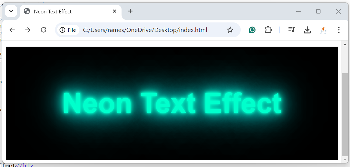
- Output: The text appears with a glowing neon effect, resembling neon lights.
Solution Steps
- Use
text-shadowProperty: Apply multiple layers oftext-shadowto create the neon glow effect. - Control the Glow Color and Intensity: Adjust the color and blur radius to enhance the neon effect.
HTML Structure
<!DOCTYPE html>
<html lang="en">
<head>
    <meta charset="UTF-8">
    <meta name="viewport" content="width=device-width, initial-scale=1.0">
    <title>Neon Text Effect</title>
    <style>
        /* Step 1: Create neon glow using text-shadow */
        .neon-text {
            font-size: 4rem;
            color: #00ffcc; /* Main neon text color */
            text-shadow:
                0 0 5px #00ffcc,  /* First layer of glow */
                0 0 10px #00ffcc, /* Second layer for stronger glow */
                0 0 20px #00ffcc, /* Larger, softer glow */
                0 0 40px #00ffff, /* Bluish outer glow */
                0 0 60px #00ffff, /* More intense outer glow */
                0 0 100px #00ffff; /* Final glow for a deep neon effect */
            font-family: Arial, sans-serif;
        }

        /* Center the text for better display */
        .container {
            text-align: center;
            margin-top: 100px;
            background-color: black; /* Background to enhance neon effect */
            padding: 50px;
        }
    </style>
</head>
<body>

    <div class="container">
        <h1 class="neon-text">Neon Text Effect</h1>
    </div>

</body>
</html>
Explanation
Step 1: Use text-shadow for Neon Glow
To create the neon glow effect, apply multiple layers of
text-shadowwith increasing blur radius:.neon-text { font-size: 4rem; color: #00ffcc; /* Neon text color */ text-shadow: 0 0 5px #00ffcc, 0 0 10px #00ffcc, 0 0 20px #00ffcc, 0 0 40px #00ffff, 0 0 60px #00ffff, 0 0 100px #00ffff; }The
text-shadowproperty creates multiple glowing layers with varying blur radii, giving the text a soft, neon-like glow. Each layer adds depth to the glow effect, starting with a subtle inner glow and expanding to a more intense outer glow.
Step 2: Control Glow Color and Intensity
- The neon effect is enhanced by using a bright color for the text and shadow (e.g.,
#00ffccfor a greenish glow). The larger the blur radius (e.g.,100px), the more spread out the glow becomes, making it appear more vibrant.
Step 3: Set Background Color for Contrast
- Setting a dark background (e.g.,
black) helps the neon text stand out, as neon colors are more effective when contrasted against a dark background.
Output
Conclusion
Creating a neon text effect in CSS is simple using the text-shadow property. By layering multiple shadows with varying blur radii and colors, you can simulate the vibrant glow of neon lights, adding an exciting visual element to your web page.
My Top and Bestseller Udemy Courses. The sale is going on with a 70 - 80% discount. The discount coupon has been added to each course below:

Build REST APIs with Spring Boot 4, Spring Security 7, and JWT
![[NEW] Learn Apache Maven with IntelliJ IDEA and Java 25 [NEW] Learn Apache Maven with IntelliJ IDEA and Java 25](https://img-c.udemycdn.com/course/750x422/6852721_b512_2.jpg)
[NEW] Learn Apache Maven with IntelliJ IDEA and Java 25

ChatGPT + Generative AI + Prompt Engineering for Beginners

Spring 7 and Spring Boot 4 for Beginners (Includes 8 Projects)
Available in Udemy for Business

Building Real-Time REST APIs with Spring Boot - Blog App
Available in Udemy for Business

Building Microservices with Spring Boot and Spring Cloud
Available in Udemy for Business
![[NEW] Full-Stack Java Development with Spring Boot 4 & React Build 5 Spring Boot Projects with Java: Line-by-Line Coding](https://img-c.udemycdn.com/course/750x422/5338984_4d3a_5.jpg)
Java Full-Stack Developer Course with Spring Boot and React JS
Available in Udemy for Business

Build 5 Spring Boot Projects with Java: Line-by-Line Coding

Testing Spring Boot Application with JUnit and Mockito
Available in Udemy for Business

Spring Boot Thymeleaf Real-Time Web Application - Blog App
Available in Udemy for Business

Master Spring Data JPA with Hibernate
Available in Udemy for Business

Spring Boot + Apache Kafka Course - The Practical Guide
Available in Udemy for Business


Comments
Post a Comment
Leave Comment